Publishing is, essentially, making things public. It is a social action that occurs between the creator and the viewer. I educate the viewer on the subject of your choosing.
I created a printed traffic signs guide that acts as a how-to manual or tool for my viewer. My book contains detailed text, images, or symbols that act as instructions to inform the viewer of something specific.
People who are not familiar with traffic signs or people who need to take a driving license exam are my audience. The reader can walk away having learned something in detail in this guide book. I printed 30 copies and distributed my pamphlets to others. I decided to distribute it to the Canal Driving School, the place where I learned how to drive.
The content of the guide book is the signs and the application of the signs on the road. I separated each page by the series of signs. I also illustrated a closed map to apply all the signs. The size of the guide poster is 10.5 x 10.5 inches. Below are the inner pages of the guide book:
I have both soft copy versions online and printed hard copies. For online access, I created 2 versions for both computers and phones.
Below are the designs for the printed hard copies. There are three kinds of style for the cover for each of the pamphlet. They are inspired and recreated from the signs. I made it looks like a little paper bag to contain the folded guide. The size of the cover is 4 x 4 inches. Below are the different versions of the cover of the guide book:


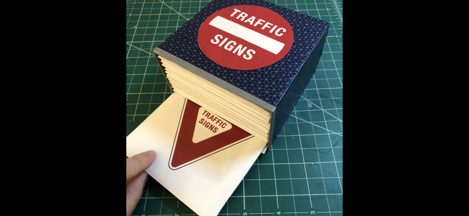
The container box for these 30 pamphlets is made by hardboard. The outside of the box is pasted with color paper tape. The tile is pasted on the surface of the top side of the box. The size of the box is 4.125 x 4.125 inches. Below are the pictures of the guide book box:
As I mentioned on top, I distributed these pamphlets at the Canal Driving School. Below are the images and the video of where I distributed them:


