Editorial Design for CONSIDER THE LOBSTER

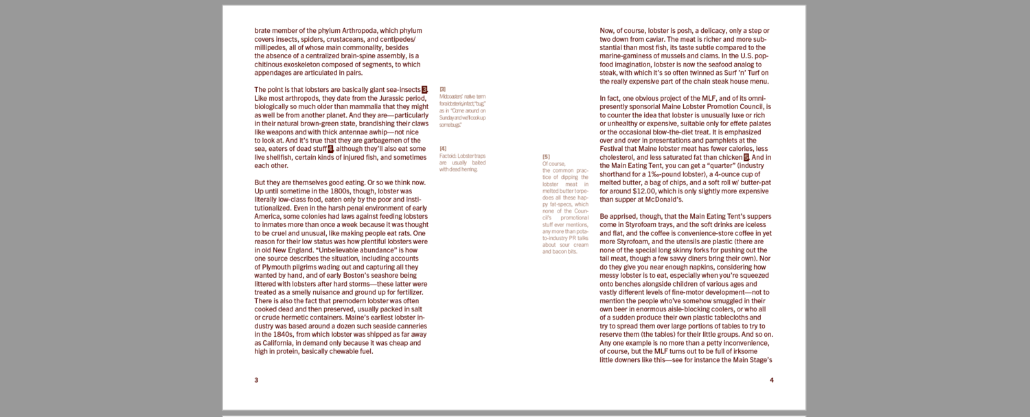
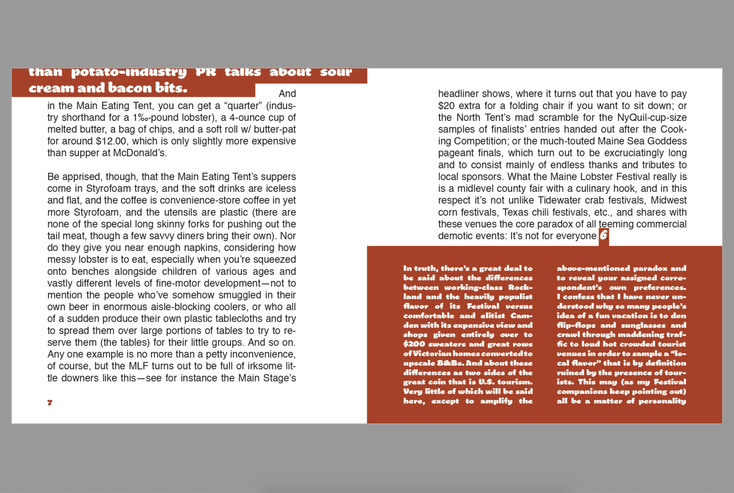
I read the essay Consider the Lobster by David Foster Wallace and I typeseted the essay in two forms. The first is to be completely functional and legible, and the other to be more expressive. With each book, I consider my interpretation of the text when setting my text (ie typeface, size, format, margins, etc). Both books are required to be text-only. Both books are required to include the footnotes, covers, colophons, headers, and folios.

For the first book, I made legibility and function my main concern and emphasise the text and let the language take center stage. I was required to use only one typeface and one color. The size of the first book is 5 x 5 inches.

Below is the design of the first book:

For the second book, expression and tone are my main concerns. I set the type less concerned about legibility. The structure of the text and footnotes relate the the essay in a more visceral way. I also conveyed the original premise and tone the author intended without being able to read it. In this way, I decided to make every footnote to be in different styles but still in the similar format. I applied multiple typefaces and two colors. The size of the second book is 5.5 x 8 inches.

Below is the design of the second book:

Traffic Signs Booklet Design

Publishing is, essentially, making things public. It is a social action that occurs between the creator and the viewer. I educate the viewer on the subject of your choosing.

I created a printed traffic signs guide that acts as a how-to manual or tool for my viewer. My book contains detailed text, images, or symbols that act as instructions to inform the viewer of something specific.

People who are not familiar with traffic signs or people who need to take a driving license exam are my audience. The reader can walk away having learned something in detail in this guide book. I printed 30 copies and distributed my pamphlets to others. I decided to distribute it to the Canal Driving School, the place where I learned how to drive.

The content of the guide book is the signs and the application of the signs on the road. I separated each page by the series of signs. I also illustrated a closed map to apply all the signs. The size of the guide poster is 10.5 x 10.5 inches. Below are the inner pages of the guide book:

I have both soft copy versions online and printed hard copies. For online access, I created 2 versions for both computers and phones.

Below are the designs for the printed hard copies. There are three kinds of style for the cover for each of the pamphlet. They are inspired and recreated from the signs. I made it looks like a little paper bag to contain the folded guide. The size of the cover is 4 x 4 inches. Below are the different versions of the cover of the guide book:


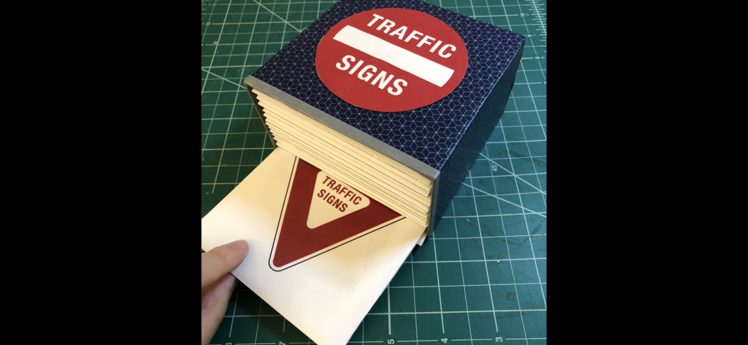
The container box for these 30 pamphlets is made by hardboard. The outside of the box is pasted with color paper tape. The tile is pasted on the surface of the top side of the box. The size of the box is 4.125 x 4.125 inches. Below are the pictures of the guide book box:


As I mentioned on top, I distributed these pamphlets at the Canal Driving School. Below are the images and the video of where I distributed them:

Multiplicity Booklets

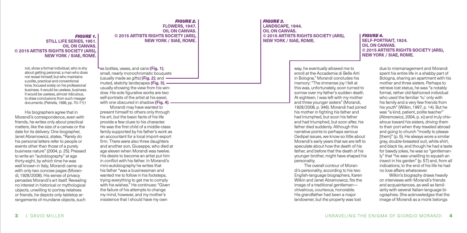
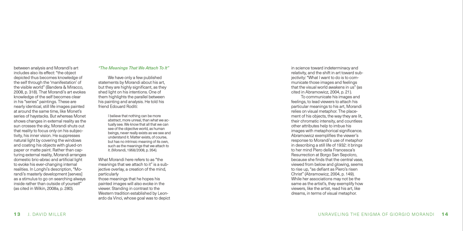
In this project, I designed and published a series of three saddle-stitched booklets using the text of three essays of choosing. Each booklet has a different size, but all three are connected through their design: they share the same typefaces, grid structure, and design concepts. These three essays are related in my favourite artists and form a clear set. I chose Giorgio Morandi, Nara Yoshitomo, and Keiichi Tanaami.

NYC Subway Card Design

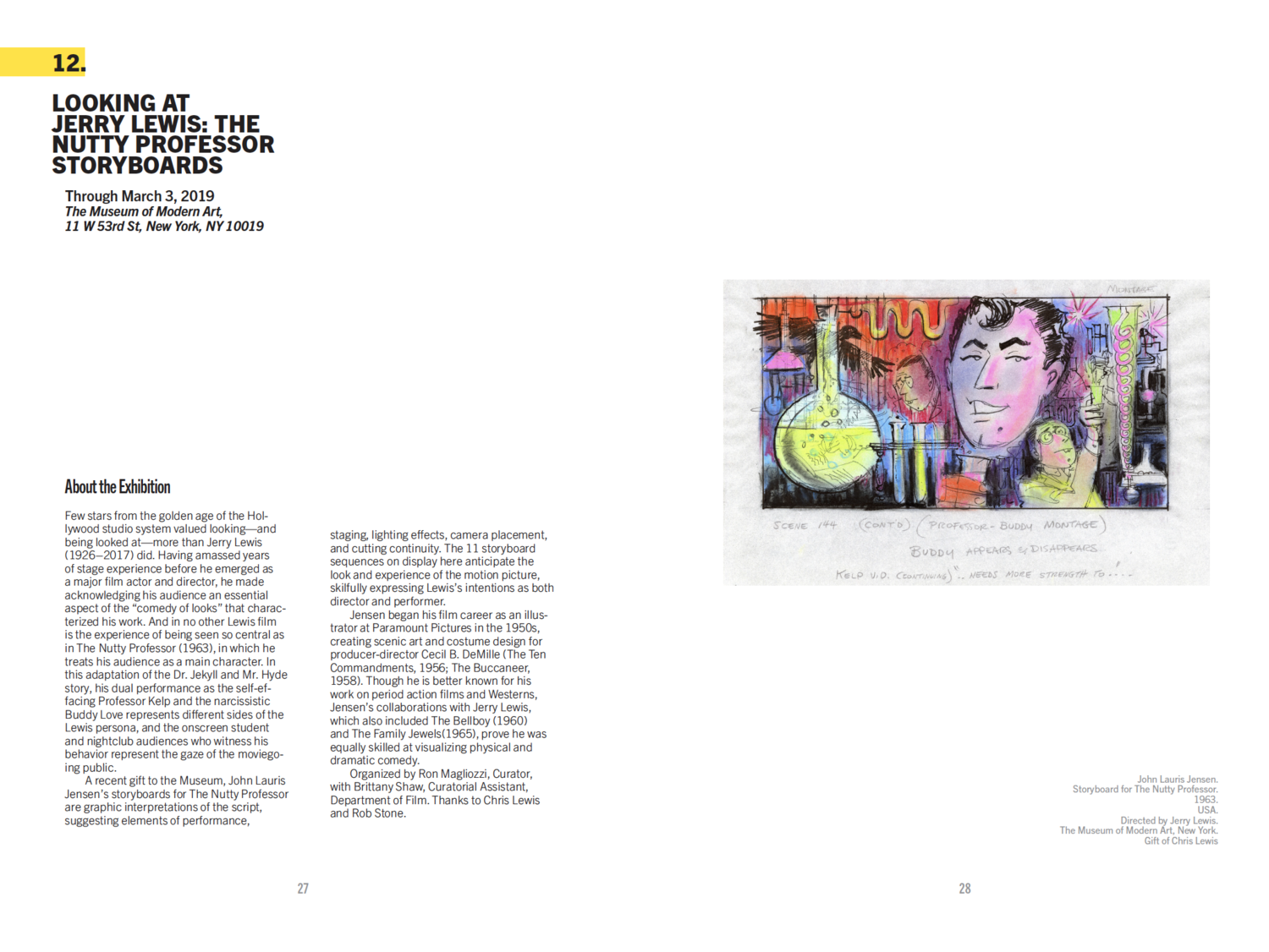
This project was to design three sets of NYC subway card. My designs are mainly inspired by The Grand Central and the New York city view. Created in October 2017.

Click on the images to view details.

Dim Sum Font

Digital art, August 2016

Digital art, August 2016

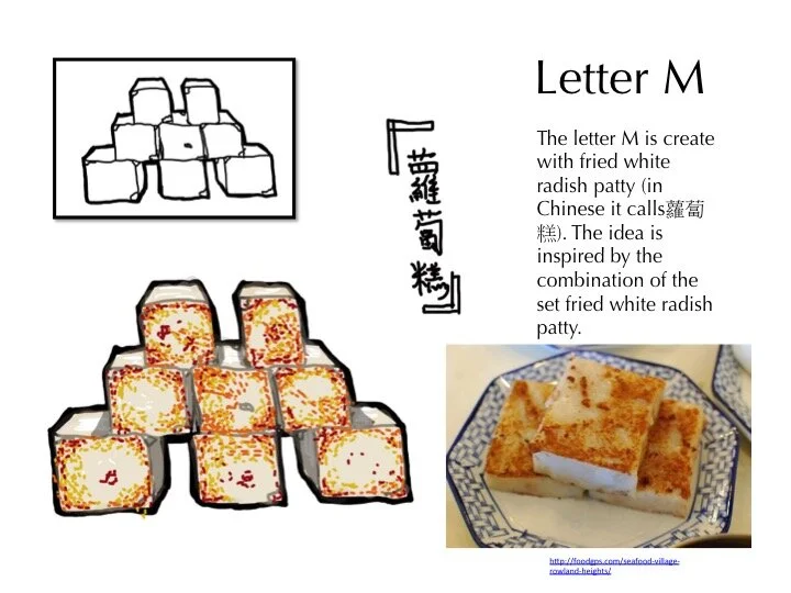
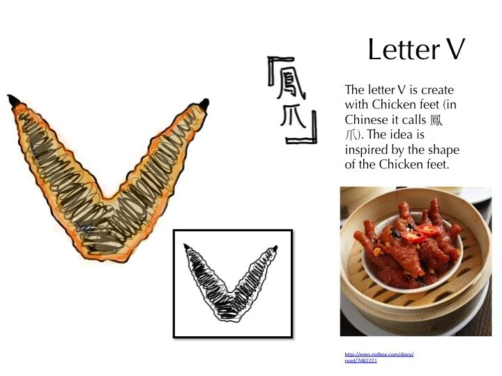
This project is about one kind of Chinese famous traditional food – Dim Sum. Because I come from Canton Province, China, Dim Sum has affected my for a long time when I grow up. Therefore, I want to use those Cantonese traditional foods to make a set of font, in order to show the beauty of Dim Sum that foods bring to Cantonese people.

Below are the introductions for each of the letter: