This project is sponsored by Honda as a Capstone project for the MIIPS program at Carnegie Mellon University during the Spring 2022 semester. The purpose of this project is to create a solution to alleviate the range anxiety of the Electric vehicle (EV) from Internal combustion engine vehicles (ICE) users. This project aims to alleviate range anxiety for Honda customers and build confidence that it will never be a problem via daily usership of users’ EVs. With this solution, we believe it could help Honda improve and increase their potential EV customers in their future EV market plan.
UX
Alibaba Xiniu Manufacture
This is the second project I would like to introduce with. It is the project I did during my internship with the Taobao team, which is the Chinese Amazon at Alibaba. I worked for Xiniu manufacture, a series of digital fashion projects including a B2B online platform and a B2C 3D modeling and video.
In collaboration with a team of engineers and product managers, I invested a significant portion of my time shaping the fundamental structure of the platform of fashion-production management for the fashion factories, the instant messaging section, and the 3-D digital fabric depiction which showcases the material textures. My role encompassed the full spectrum of the project, from initially identifying the problem to finalizing the design of the minimum viable product (MVP), formulating the feature roadmap, and coordinating closely with engineers to refine the final hand-off details.
GROOP: On Campus Interaction Application
This project is to design a mobile phone user interface for college students to socialize in the post-pandemic era. The purpose of this application is to encourage students to hold events and activities on campus based on their studies and entertainment in the situation of being isolated because of Covid-19. With this application, students can have meetings and all types of events based on their course codes and meet with students and faculties in the same course without having their contact information.
Websites of Divinatory Methods
Concept
The two websites in this series mainly discuss the content of divination superstition. The first website researched the floor plans of houses through Feng Shui from China, and added interactive functions to the website. The second website compares two divination techniques (divinatory sticks and tarot cards) to determine whether people should rely on divination.
Target
Consumer age range: adult
Target audiences:
people who do not believe in divination
people who want to know different divinatory methods through the one they are familiar with
1st Website: Feng Shui of Floorplans
Inspiration
My first project originated from the recent experience of a relative who just bought a house. He hired a Feng Shui consultor for suggestions of buying house properties, and he finally chose the one that I thought was not as ideal. However, in less than half a year, he made a fortune from running a medical business because of the Covid-19 pandemic. He attributed it to his good Feng Shui house. I started to wonder whether the house can really change fate, so I started to study the Feng Shui of the houses and made it the subject of my first project.
Purpose
I try to explore the concept of Feng Shui through the lens of the advantages and disadvantages of different floorplans. This design intends to speak to the people who want to know how those so-call superstitious methods influence their daily life, and for the people who plan to buy a property and are interested in this aspect.
This design aims at not only warning the audience about the Feng Shui shortcomings that they need to avoid when buying a house but also helping them comprehend what kind of positive characteristics their new place should have had for living.
2nd Website: Discrepancy Divination
Inspiration
Extending from the first project, I began to want to promote the concept of Feng Shui from the perspective of propaganda. I learned that not many people know this divinable knowledge, and some even don’t believe that these so-called symbols or knowledge can symbolize their future. Thus, I start to prepare to explore different divination methods and their respective content, by the lens of showing their respective steps and divination results:
Is the divination process shocking?
Can the divination result accurately predict the final result?
By showing the process of divination and the results of divination, tell the confused people whether they should rely on these divination results.
Purpose
The goal of this work is to show the difference in the process of different divination methods. The objects of comparison are fortune-telling methods from the East vs. the West, which are divinatory sticks and tarot. I will record the process of my personal experience in the form of a website and put it together for comparison, hoping to explain the results of the two divinations and see whether they can predict the future or not.
Xiaomi Smart Home App
This project is to design a mobile phone user interface for Xiaomi Smart Home software. Xiaomi Smart Home is a complete set of closed-loop experience composed of smart hardware products of Xiaomi Eco-Chain Enterprise. The Xiaomi Smart Home APP is a unified device connection portal, deeply integrated into the MIUI system, and the lock screen interface integrates the device control center to simplify the operation process and facilitate users to quickly connect and use Xiaomi smart hardware devices with one click.
Branding Requirements
Cozy feeling. This software focuses on smart homes. The purpose is to let users experience the warm feeling of home while they are using.
User-friendly. The software has a broad audience - both male and female; the youth and the aged; the tech-newbie and the expert. So the software interface should be in explicit language and inclusive to all the target users.
Follows the trend of design. Recent design trends are characterized by flatness and roundness.
The use of colors should conform to the brand's positioning.
Wireframe Design
#1 Beginning Interface
These two interfaces are the interfaces displayed when the software launches. The one on the left is the buffer interface, and the picture in the middle will be placed with illustrations or advertising banners. On the right is the interface for the user to log in to the software.
#2 Home Interface
These five interfaces are the “Home” page.
Room display: Because this software aims to facilitate the use of smart homes, the room options are displayed when the software launches. Users can view the smart home appliances in each room by clicking on each thumbnail/card.
Add button: Users can add a new room or new device by clicking the plus sign in the upper right corner.
Equipment display #thermostat: This display is the exclusive setting page of the thermostat. The user can control the temperature through the dial on the right. There are buttons to control cooling, heating, and settings in the lower-left corner.
Equipment display#main lights: This is the exclusive setting page of lights. The user can control the brightness of the light through the dial on the right. There are buttons on the lower-left corner to control the bulb's wattage and adjust the color of the light.
Equipment display #thermostat setting interface: This shows the thermostat setting page. Users can control the cooling, heating and fan buttons through the upper part. There are plus and minus buttons on the left and right sides to control the temperature. Shown below are indoor temperature and humidity and outdoor temperature and humidity.
#3 Statics Interface
These three interfaces display the data of the room. The software will automatically record the data. Users can view past data records through the calendar. In the view detail interface, the user can see the specific data of each room and each device.
#4 Routines Interface
These two interfaces are for setting daily plans. Users can add a routine through the plus button in the upper right corner to let the smart home automatically start at regular intervals. On this main page, the user can choose whether to turn on the device through the toggle button.
#5 Setting Interface
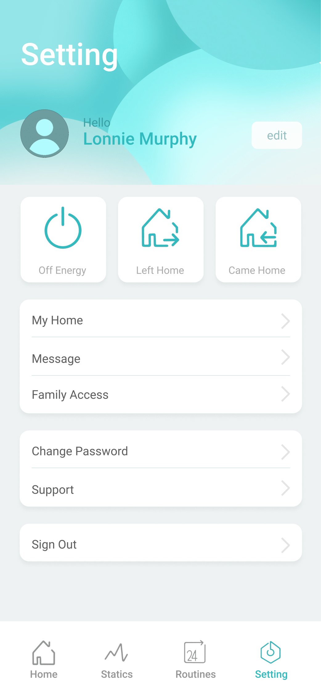
The user can set the software on this interface. The top one is the user’s avatar and name. The user can set personal information on the edit button on the right. The middle column is the three most-commonly-used control buttons. Below are some less-frequently-used settings for the software.
Elements Design
Visual Design
The overall color is in line with Xiaomi's smart home positioning.
In order to create a cozy feeling, all patterns and panels are curved, giving a soft feeling
The software style conforms to the trend of the recently updated software system style
All icons are composed of simple dots, lines, and planes
Added smooth page transition animation
The color of the interface changes slightly according to the characteristics of the product
The color matching is not complicated, and ambient colors are used.
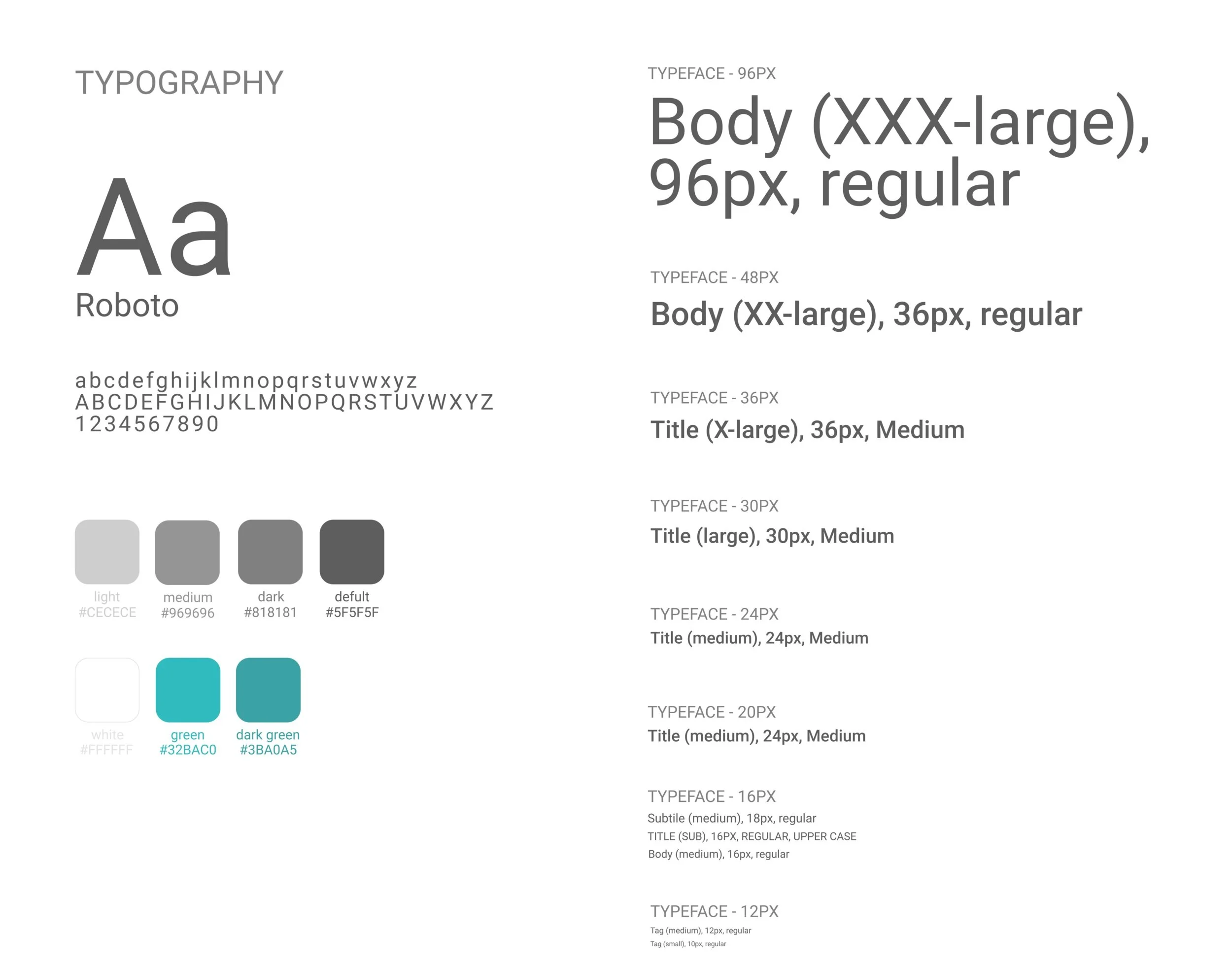
Fonts and navigation bar are simple, and the font and color can be clearly distinguished from the background color.
Motion Design
Egg Package
The project aims to design egg packaging that is convenient for production, transportation, and retail. To respond to the concept of sustainability, the choice of materials also requires the use of environmentally friendly materials.
Design goal:
Facility for factory production. The entire package is cut from a sheet of paper and only needs to be folded a few times to form.
Sturdy package to ensure good condition on arrival. The shape of the egg box is composed of several triangles because the stability of the triangle can protect the eggs well.
Convenient to demonstrate. The entire egg carton is also convenient for retail stores to place without wasting too much storage space.
Environmentally friendly. The material I chose is reusable recycled paper.
Process:
Buy eggs from the supermarket and measure the circumference of the widest part of the eggs. 20 normal-sized eggs were measured and averaged from the data.
According to the average perimeter of the egg, one side of each triangle bar is calculated to be approximately 2.85cm, and the total length of the paper bar is approximately 14.25cm according to the drawing. Through many calculations, I calculated the sizes of the drawings on the drawings (top left image).
Make 10 egg-box models based on the calculated results (top right image).
Test the drop resistance. The egg-box model filled with raw eggs was dropped from a height of 1m and 1.5m respectively to test whether the eggs inside would break. Experiments proved that the eggs used in both experiments were intact.
Test the cleanliness of placement. Put 8 egg box models on the supermarket shelf and check whether it is convenient to put them.
Ask for opinions. Give the sample to 10 participants aged 14-80 of different genders to experience, test whether the sample is convenient to use, and invite them to fill out a satisfaction questionnaire. According to the questionnaire, the average user satisfaction is 80%.