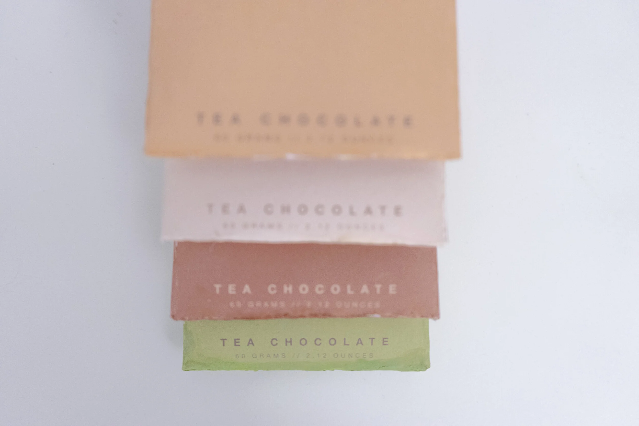
The purpose of this project is to design the packaging for a set of customized chocolates. The chocolate I designed has four flavors, namely bubble tea flavor, Thai milk tea flavor, matcha flavor, and Earl Grey tea flavor. The chocolate brand is designed around "tea" as the highlight of the packaging and has different illustrations according to tea’s different flavors. The series includes chocolate packaging design and brand logo design.
Target
Consumer age range: 16 - 26
Target market: European and American
Sale at the mid-market supermarket (e.g., Trader Joe’s)
Price range: USD $6 - $8 per bar
Highlights of design
Snap closure design: convenient to store when divided into portions.
Double-sided printing, the middle and lower parts of the front and back have the representative color corresponding to the taste.
The digital pattern on the front of the package is the latitude and longitude coordinates of the source of each tea drink. I distinguish each chocolate by the geographical location of its birthplace.
The back of the package tells the origin of each tea drink’s beverage and the ingredient list.
Inside the package is an illustration of a tea drink corresponding to the taste, with simple geometric shapes.
Process
Conduct User Research on Flavors
I use four kinds of tea as the taste of my chocolate brand because of the rise of milk tea in the European and American markets, and even caused an upsurge among young people. So as a milk tea lover, I decided to use tea drinks as the theme.
Before brainstorming, I made a questionnaire for people between 16 and 26 years old to investigate their favorite tea drinks. A total of 45 people participated in my survey. I learned from the questionnaire that 35% of people chose bubble tea, 21% chose matcha, 18% chose Thai milk tea, and 14% chose Earl Grey tea. So I decided to make chocolate with these four flavored tea drinks.
Conduct Research on and Design Package Style
I have researched three packaging methods, namely the most common top opening and closing, innovative tear strip opening and closing, and unenclosed opening and closing. I discussed the pros and cons of the three with my classmates and teachers:
(Left image) The one on the left is the most common top opening and closing. The advantage of this kind of packaging is that most buyers know how to use it, and it is convenient for multiple times of storage. The disadvantage is that it appears widely on the market and is relatively common.
(Middle Image) The middle is an open opening and closing. The advantage of this opening and closing is convenient storage, and the inside of the package can also be decorated with illustrations. The disadvantage is that the opening and closing method is more complicated than the first one.
(Right Image) The tear strip is torn open from the middle of the package. After the middle of this package is torn open, and the bottom forms a cup shape. After tearing it open, customers will see a cup of tea when looking inside. The advantage of this idea is that the concept is novel, but the disadvantage is that it is inconvenient to use multiple times and excessively complicated.
Based on our many discussions and testing the practicability of various models, we all agreed that the second model (middle image) is the most suitable for my chocolate theme.
Choose Color & Typography
Base on the characteristics of each tea drink, I designed a set of color and geometric patterns to indicate:
Bubble-tea flavor: light warm-tone color, with brown circles on averagely, indicating bubbles.
Thai-tea flavor: orange base with gradient color change at the bottom to indicate tea sediment of the Thai tea.
Matcha-tea flavor: a thin layer of light green on top with irregular white circles to indicate bubble top of green tea.
Earl-gray flavor: kermesinus color base with groups of mulberry color stripes, which indicates tea leaf of the earl gray tea.
Below is my final print version for the packages with four flavors:
I made the color usage table for this design. It contains the color parameters I used for each flavor and the geometric figures with their style. The table also includes the fonts, and a set of font designs for numbers and punctuation specifically designed for the latitude and longitude for the front surface.
Choose The Use of Materials
Based on the package’s cost, I decided to use 350g white pearl card paper, to have higher durability of the package, which has its unique glossy color to shine the illustrations on the package.
I also add embossment texture on the title of the front surface to highlight.
Galleries
(Click to view)


